Statistics have long been used to describe data in general terms. For example, things like variance and standard deviation allow us to understand how much variation there was in some data without having to look at every data point individually. They give us a rough idea as to how consistent data is. However, knowing variance alone does not give you the full picture as to what the data truly is in its native form.
Statistics are great for describing general trends and aspects of data, but statistics alone can't fully depict any data set. Francis Anscombe realized this in 1973 and created several data sets, all with several identical statistical properties, to illustrate it. These data sets, collectively known as “Anscombe's Quartet,” are shown below.

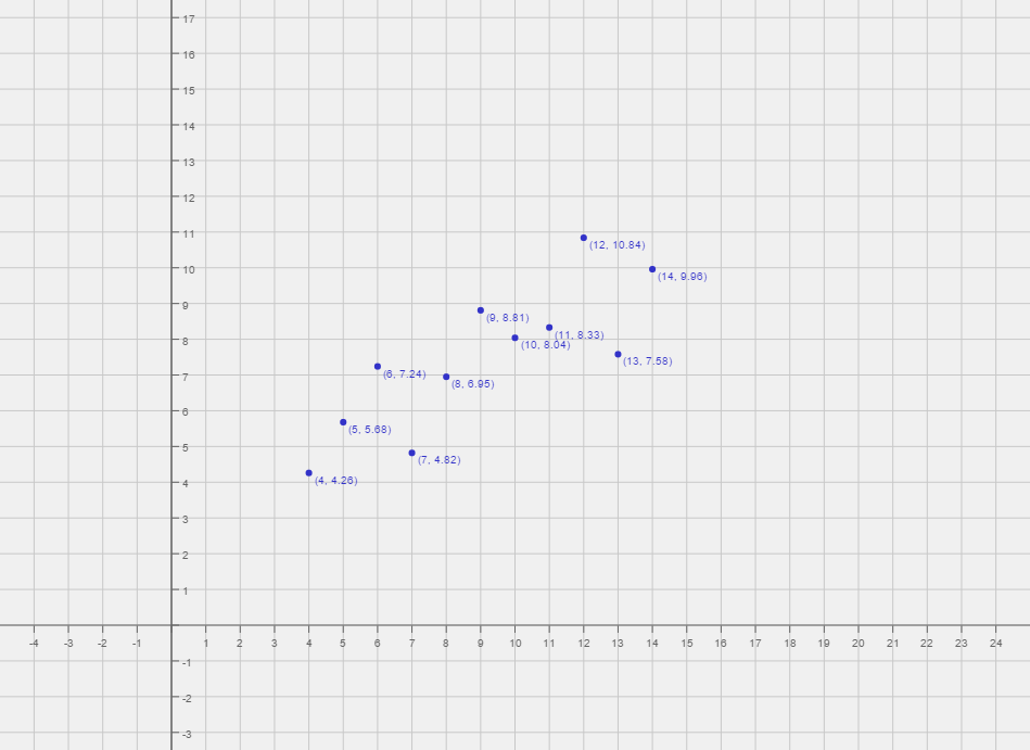
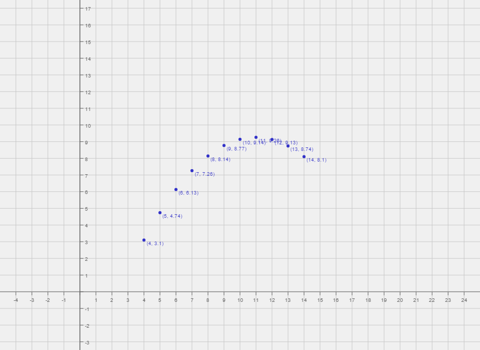
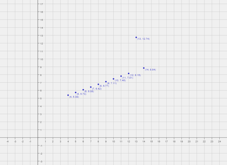
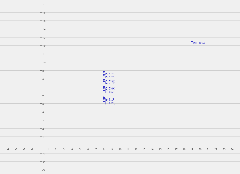
Graphs generated by meta-calculator.com
All four of these data sets have the same variance in x, variance in y, mean of x, mean of y, and linear regression. But, as you can clearly tell, they are all quite different from one another. So, what does this mean to you as a statistician?
Well, to start, Anscombe's Quartet is a great demonstration of the importance of graphing data to analyze it. Given simply variance values, means, and even linear regressions can not accurately portray data in its native form. Anscombe's Quartet shows that multiple data sets with many similar statistical properties can still be vastly different from one another when graphed.
Additionally, Anscombe's Quartet warns of the dangers of outliers in data sets. Think about it: if the bottom two graphs didn't have that one point that strayed so far from all the other points, their statistical properties would no longer be identical to the two top graphs. In fact, their statistical properties would more accurately resemble the lines that the graphs seem to depict.
how to analyze your data. For example, while all four data sets have the same linear regression, it is obvious that the top right graph really shouldn't be analyzed with a linear regression at all because it's a curvature. Conversely, the top left graph probably should be analyzed with a linear regression because it's a scatter plot that moves in a roughly linear manner. These observations demonstrate the value in graphing your data before analyzing it.
Anscombe's Quartet reminds us that graphing data prior to analysis is good practice, outliers should be removed when analyzing data, and statistics about a data set do not fully depict the data set in its entirety.