.
Discussion/Introduction
Our graphing units in third grade used to be focused primarily on circle graphs (pie charts), but under the Common Core, bar charts are given a new prominence. Bar charts are intuitively easy to understand for second and third graders, and since they build on and are closely connected to the number line, they follow logically from the other math your students are doing.
But just because bar charts are taking center stage , doesn’t mean we can stop teaching pie charts altogether. While bar charts make comparing the relative size of parts a simple visual exercise, pie charts offer intuitively obvious visual comparisons between parts and the whole. Teaching circle graphs also enables our students to practice fractions in a fun, easy-to-grasp way.
This lesson plan focuses on gaining a visual understanding of whole-part relationships through the use of a simple circle graph, and also gives students an opportunity to practice fractions , as required by section 3.NF.3 (Number and Operations—Fractions) in the Common Core. “Explain equivalence of fractions in special cases, and compare fractions by reasoning about their size.”
Objective
To understand a pie chart (circle graph) and to be able to deduce information about the relative size of the parts shown in it. To be able to compare fractions by reasoning about their size (Common Core 3.NF.3)
Supplies
- A graph printout from http://www.meta-chart.com/pie, a free pie chart maker
- Paper cutouts: a large circle cut out of thick white paper, and ½, ¼, and \( frac{1}{8} \) sectors of circles cut out of different colors of construction paper.
- Paper and markers/crayons/colored pencils for each student
Methodology/Procedure
Start with a review of fractions. Show the students your white circle, and ask what they think of when they see it. Give them some time to discuss what a circle means to them, and validate their feelings and opinions as they share them. These opinions can be as simple as ‘pizza!’ or as abstruse as ‘unending’; there is no one answer. When they have all had a chance to share how they feel about it, explain that to you, since it is a whole, entire circle, it can mean a ‘whole’ of anything—a whole class of children, a whole country, a whole family, a whole bag of skittles.
Cover half of your circle up with your ½ circle construction paper cut out, and ask how much of the circle is colored now. After the students have answered, tell them that since the whole circle meant to you a whole of anything – a whole class, a whole country, a whole bag of skittles—the colored sections mean, to you, half of anything. Half a bag of skittles, half a class, half a country.
Ask half the class to hold up their hands; the front half, the back half, or the side half. Then tell them that you could use this circle to show how many children had their hands up; the colored section would be the children with their hands up, and the white section would be the other children.
Take off the half circle of construction paper and replace it by the ¼. Ask your students if they know how much of the circle is shaded now. They will probably be ready with the right answer; if anyone is unsure, show that ¼ is half of a half, and that four quarters cover the whole circle. Ask a quarter of the class to raise their hands; you will probably have to mark off the demarcation lines for the quarter. Tell them that if the whole white circle represents the class, that construction paper quarter is the part of the class with their hands up.
Go on to \( frac{1}{8}\), introducing it the same way with your \( frac{1}{8}\) construction paper sector.
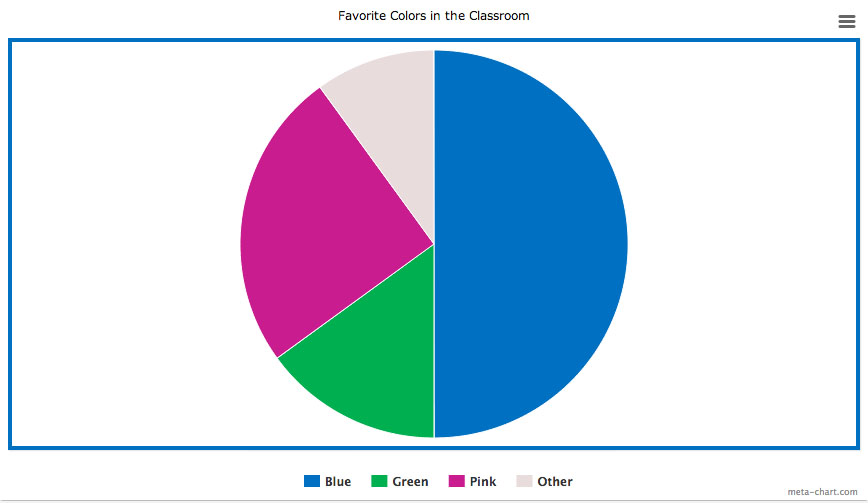
Now show the students the graph printout from http://www.meta-chart.com/share/favorite-colors-in-the-classroom and tell them it is a graph which shows the favorite colors in a class of students like yours. Tell them it is called a pie chart, and ask them if they know why.
Ask which color is the biggest favorite. Then ask which of the three explicitly listed colors the least amount of children seem like.
Now tell them the class was made up of twenty students, and ask them how many students liked blue. Ask whether fewer or more than six students have green for their favorite color, and whether or not five students have purple for a favorite color. Ask if four students might have purple for a favorite color, and then whether two might have liked purple best.
Now take a poll of favorite colors in your classroom, and put the data on your blackboard. It may look something like this:
- Blue – Zack, Katie, Markus, Peter–4
- Green – Jamie, Paul, Christian-3
- Red – Jordan-1
- Pink—Mallory, Katie, Jennifer, Desiree, Madeline-5
- Purple – Desiree -1
- Yellow—Sofia, Edwin -2
Tell your students you want them each to make a pie graph for you, using this data. Suggest they group the smaller amounts together under ‘other’; in the example above, this would be red, purple and yellow, totaling four. Then start with the color most children like, and ask what fraction of the total number of children like that color. In the example above this would be \( frac{5}{16}\). Help the students relate this to the fractions you’ve already discussed; in this case; just a little more than \( frac{4}{16} = frac{1}{4} \). Have the students color a generous quarter on their circles, and go on to the next color: in this graph, blue, \( frac{4}{16} \) or exactly \(frac{1}{4} \) of a circle.
At this point you don’t want to focus on the nitty gritty—for instance, it would be counterproductive to divide your circle into sixteen, twenty, or thirty equal portions—as many portions as you have students in your class—and make an exact circle graph by coloring in the appropriate number of sectors. Instead, you want to focus on getting an intuitive sense of the size of different fractions. Your students will do this by relating the fractions they are unsure of—how much is \(frac{5}{16}\), anyway? to what they already know. In this case \( frac{4}{16} = frac{1}{4} \) which is a nice solid quarter, and the \(frac{1}{16}\) it goes over is less than \(frac{1}{8}\), which is a fat sliver.
When your students have all created their own graphs have them take turns explaining what they drew and what different sectors mean. Ask them which color is favorite, which is second favorite, which is third favorite. Ask them how the graphs would change if one child changed his favorite color– for instance, if Madeline decided she preferred blue or Jordan switched to green. Then ask them what would happen to the graph if your class was merged with another third grade class of the same size, and all the children in that class liked yellow best.
These exercises should give your students a new familiarity with and perspective on fractions, as well as opening the doors to understanding data representation with pie charts.
 Download this lesson plan